An iconic, bespoke design that captures the Rye River identity, paired with exceptional pouring performance.
Introduction
In the world of craft beer, every detail shapes the drinking experience. It’s not just about product quality, but also how it is presented and served.
This vision led to the collaboration between Celli and Warsteiner to create the new Rye River beer font, a custom-designed beer dispensing system that combines iconic design, storytelling, and high performance.
More than a draft tower, it transforms the act of pouring into a true ritual.
Challenge
Warsteiner’s goal was to develop a beer font capable of standing out in premium on-trade environments while fully expressing the identity of the Rye River brand.
The challenge for Celli was to:
- translate the brand’s values—tradition, craftsmanship, and innovation—into a distinctive and iconic design
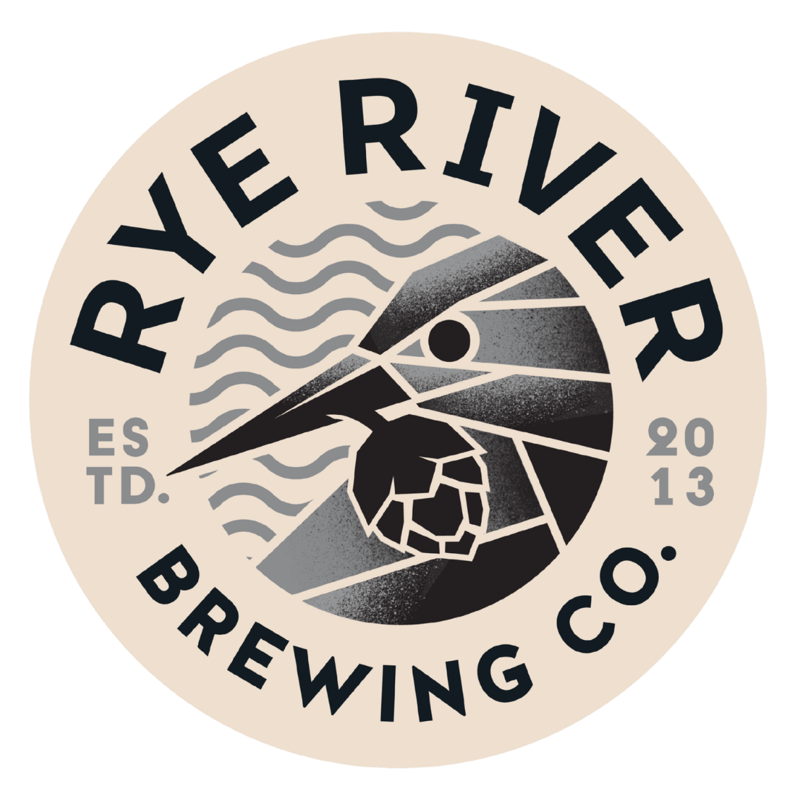
- incorporate the symbolism of the kingfisher, Rye River’s emblem, turning the pouring moment into a meaningful ritual
- ensure excellent performance and flexibility across different beer styles
The result had to go beyond functionality, becoming both a brand statement and a high-performance beer dispensing solution.
Solution
Celli developed a fully custom beer font where every detail is designed with precision and intent. The geometric lines, inspired by origami, give the structure a bold and instantly recognisable identity.
At the heart of the design is the kingfisher, the brand’s symbol, guiding the consumer through a ritual of discovery—bridging brewing tradition with the future of craft beer.
From a technical perspective, the system includes:
- a Celtic tap with pre-installed sparkler, ideal for stout pouring
- quick sparkler removal, ensuring flexibility across beer styles while preserving carbonation and mouthfeel
- interchangeable lens for visual customisation
- integrated LED lighting to enhance both product visibility and design impact
The same attention to detail found in the design is reflected in the pouring process. The beer font is engineered to honour the product and deliver consistent, high-quality service, turning precision engineering into perfect execution in the glass.
Results
The result is more than a beer font—it is a true brand asset within the venue.
This project delivered:
- stronger brand visibility and recognition for Rye River
- a pouring experience elevated into a ritual, driven by the symbolism of the kingfisher
- a perfect balance of design and performance
- a versatile and reliable beer dispensing system for operators
The Rye River project showcases Celli’s ability to create bespoke solutions that combine iconic design, storytelling, and engineering excellence, enhancing both brand value and the overall drinking experience.
"The new Rye River beer font is a design project developed through the fruitful collaboration between the Italian teams at Warsteiner Italia and Celli, conceived to showcase the award-winning Rye River Irish beers to their best advantage and offer enthusiasts a dedicated, recognisable and distinctive pouring experience. It is not merely a technical component, but a symbol that embodies care, expertise and respect for brewing culture."
Luca Giardiello , Chief Executive, Warsteiner