TAG:
BRAND
CELLI GROUP
12
09
2017
09
2017
The Celli Group is a global player that is growing exponentially and expanding around a project fully dedicated to beverage dispensing.
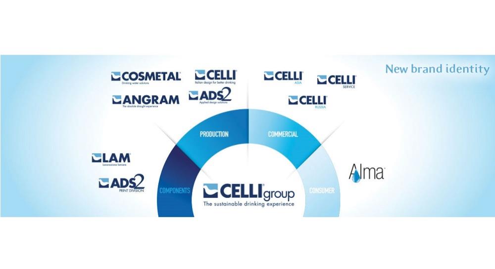
It is a complex system of companies and brands, organized and structured to address multiple needs across the entire value chain.
As companies expand under the umbrella of the Group, a fundamental need arises to create a new brand architecture, suited to communicate the power of the Group and to distinguish the essence of the different brands corresponding to specific competences and product ranges, while preserving their market identity and common origin.
An in-depth research resulted into the reorganization of the portfolio of the Celli Group’s brands across the value chain, each with a specific role, target, and objectives, and with a shared and consistent image.
This significant change is aimed at defining a new Group identity capable to clearly and consistently communicate change, growth, dimension and, last but not least, a powerful Group vision through harmonious brand architecture design.
The new group colours include dark blue, a symbol of union and trust, which best represents cohesion among the group companies, and clear blue, the colour of change and technological innovation. White stands for ease of use, design, and clean forms, and remains the main feature of the logo.
The seal icon, loaded in time with the company values and history and now clearly identified on the market, was stylized into a soft and light form, to represent the Group’s vision in a modern, yet recognizable way. The blue Celli font, iconic and easily recognizable, looks more modern and appealing.
The payoff “The sustainable drinking experience” perfectly summarizes the Group’s vision.
 Die zu Ardian gehörende Celli Group, weltweit führender Hersteller von Getränkeausschankgeräten und Zubehör, gibt die Ernennung von Federico Testarella zum...
 Ardian-owned Celli Group, global leader in the design and manufacturing of beverage dispensing equipment and accessories, announces the appointment of Federico...
 Celli Group, empresa líder a nivel mundial en el diseño y fabricación de equipos y accesorios para la dispensación de bebidas, propiedad de Ardian, anuncia el...
 Celli Group, leader mondial dans la conception et la fabrication d'équipements et d'accessoires de distribution de boissons, détenue par Ardian, annonce la...
 Celli Group announces a significant change in its Celli and Cosmetal brand's product manuals. Starting today, the manuals will be available online in the new...
 Ardian-owned Celli Group, a leading global player in the design and manufacturing of beverage dispensing equipment and accessories, announces the appointment...
 Celli Group, une entreprise leader mondiale dans la conception et la fabrication d'équipements et d'accessoires de distribution de boissons, détenue par Ardian,...
 Die Celli Group, ein führender globaler Akteur im Bereich der Gestaltung und Herstellung von Getränkeausgabegeräten und Zubehör, im Besitz von Ardian, gibt die...
 Grupo Celli, empresa líder a nivel mundial en el diseño y fabricación de equipos y accesorios para dispensar bebidas, propiedad de Ardian, anuncia el...
 We are pleased to share that Celli has been awarded the "Silver" recognition in the 2022 Sustainability Rating by Ecovadis, showing a 15% improvement compared...
 Rimini, 2 March 2023 - The Celli Group, a company specialised in the design and manufacture of beverage dispensing equipment and accessories, announces it has...
 Rímini, 2 de marzo de 2023 – El Grupo Celli, empresa especializada en el diseño y fabricación de sistemas y accesorios para la dispensación de bebidas, anuncia...
 Rimini, le 2 mars 2023 – Le Groupe Celli, société spécialisée dans la conception et la production d'installations et d'accessoires pour la distribution de...
 Rimini, 02. Marsch 2023 - Die Celli Group, ein Unternehmen, das auf die Entwicklung und Herstellung von Getränkeschankanlagen und Zubehör spezialisiert ist,...
 The Celli Group, a company specialising in the design and production of beverage dispensing systems and accessories, has announced its strategic acquisition of...